These charts show the number of Americans receiving food stamps as reported by the United States Department of Agriculture. As of the latest data released on September 3, 2021 the total is 42.3 million. If our food-stamp population were a separate country, it would rank at #36 among the world’s 233 countries. (See the list here.)
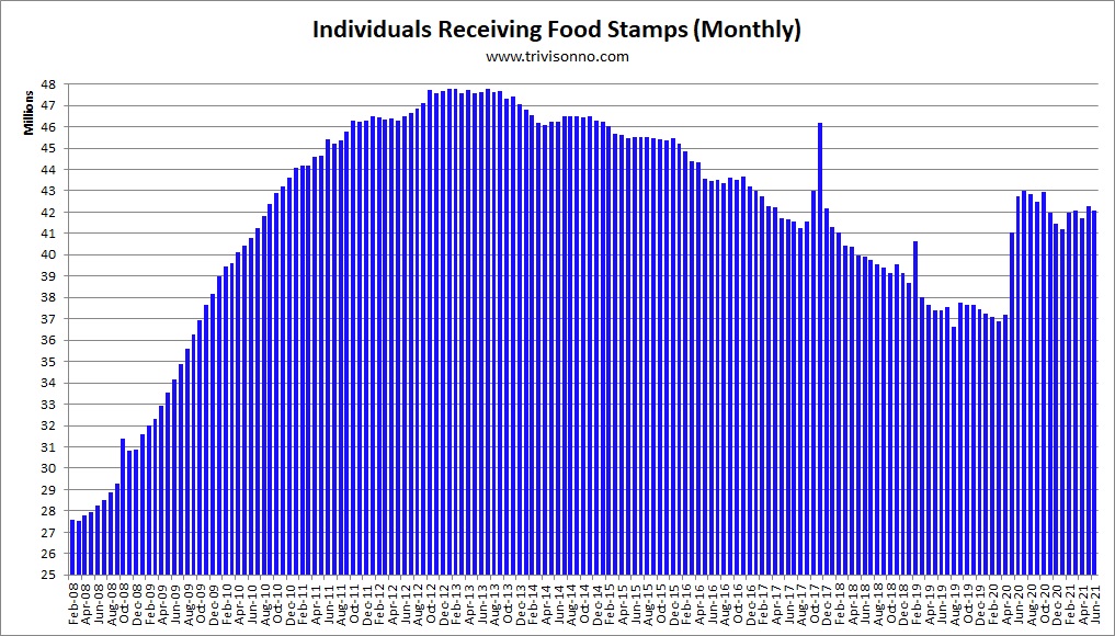
The first chart below shows monthly totals since the Great Recession (click charts to enlarge):
The second chart shows annual totals back to 1975.

Note: The chart above is the average size of the food-stamp population over the year.
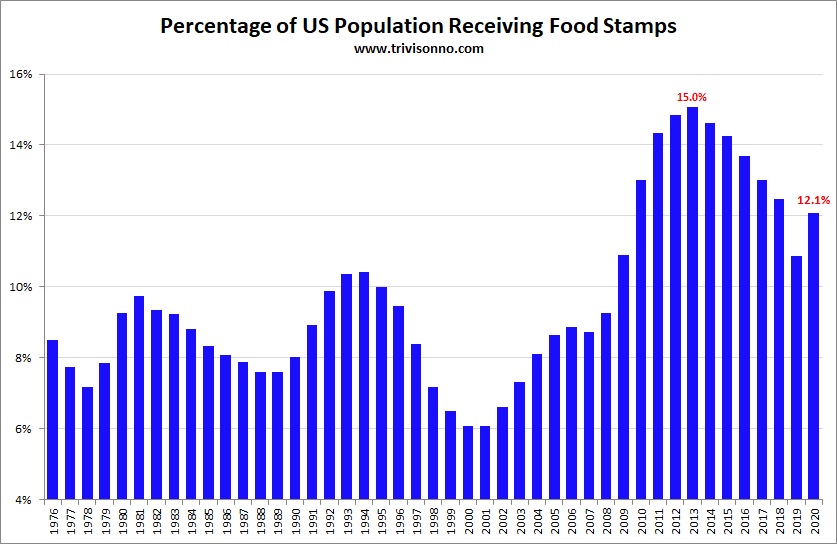
The next chart shows the percentage of Americans on food stamps (using FRED’s “POP” data series):
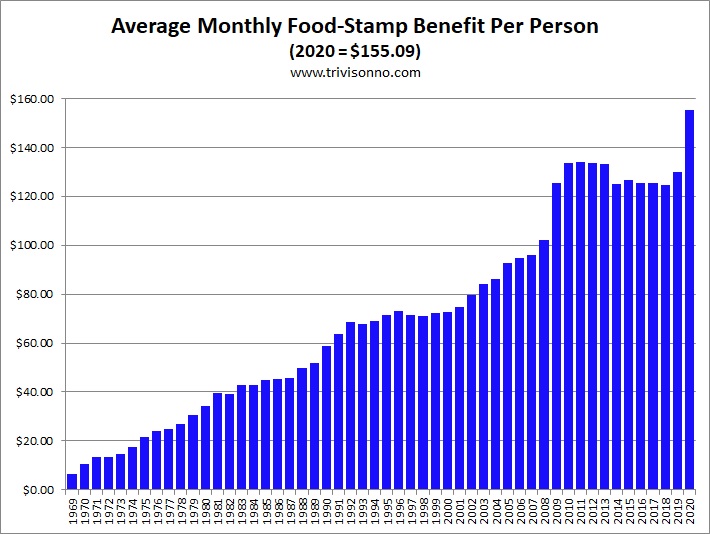
The next chart shows the monthly amount paid to recipients. Starting from $6.63 in 1969, the amount has risen steadily, primarily due to inflation, and spiked to an all-time high during the pandemic:
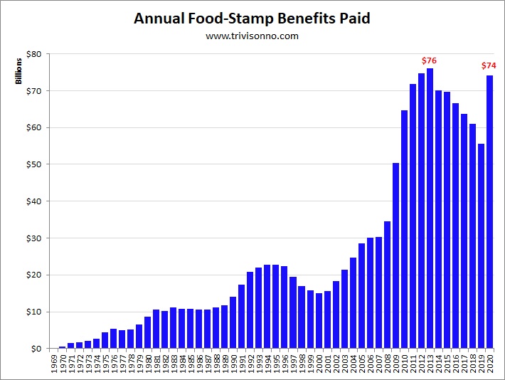
The next chart shows the total annual benefits paid out. At $74.2 billion in fiscal 2020, this is a major program:
A program with this many participants incurs huge administrative costs: $5 billion in 2020 – and that is only the federal government’s share. In addition, each state spends money to administer their end of the operation. The chart shows only federal expenses:

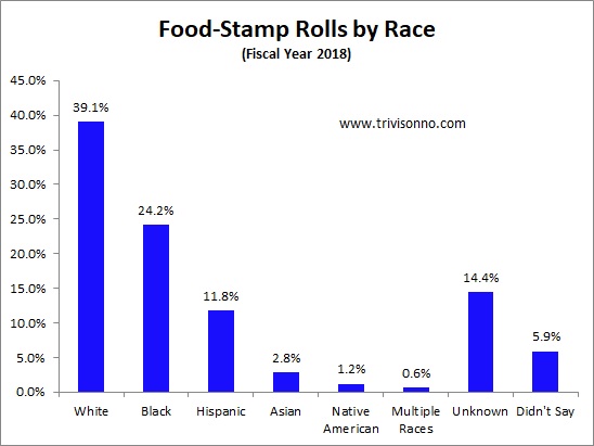
The next chart shows the breakdown of participants by race (see table A.21 of this USDA report):
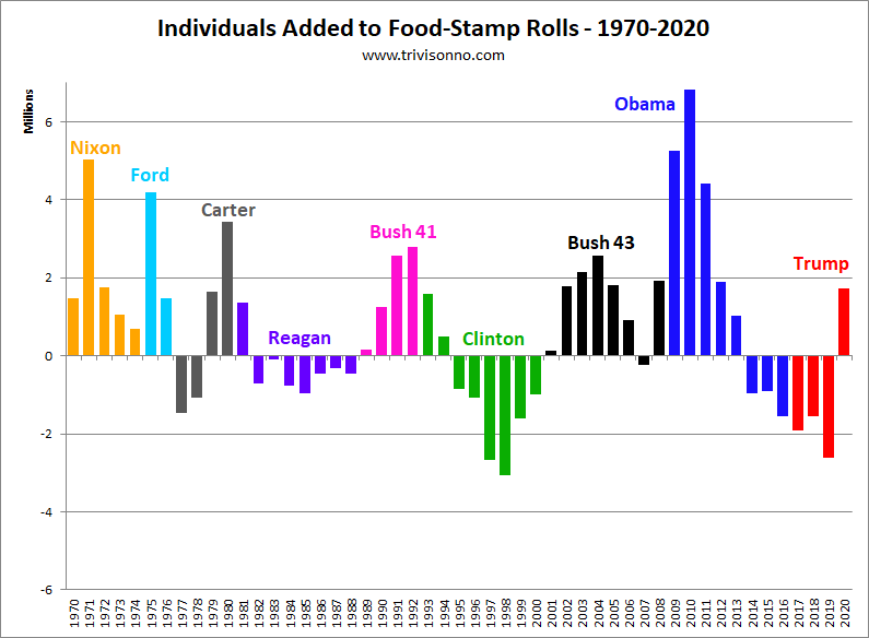
The next chart shows the number of individuals added to, or subtracted from, the food stamp rolls highlighted by presidential administration:
The next chart shows the numerical totals for each president. Keep in mind that not all presidents were in office for the same number of years:
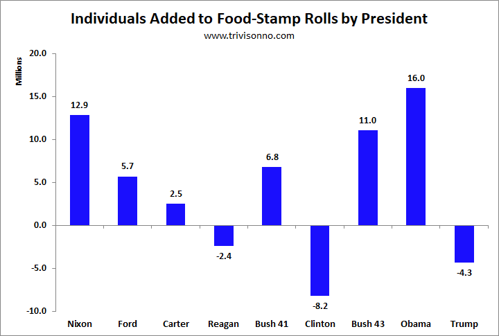
Note: The Trump Administration did not provide accurate data for fiscal years 2019 & 2020, so those years are estimated on the two charts above. I was hoping that the Biden Administration would fix the data, but they have not done so.
Notes
Note: The numbers for Presidents Trump, Obama, and Bush (43) are higher than they otherwise would have been because the government started to use food stamps for disaster relief starting in 2005 for Hurricane Katrina. However, keep in mind that poor people are more vulnerable to natural disasters. Imagine a union factory worker in Ohio making $28 per hour, and a non-union factory worker in Florida making $8. Then they are both victims of a natural disaster. Which one is more likely to end up on food stamps? The worker in Ohio probably has some money saved, while the worker in Florida was living paycheck-to-paycheck. So, one could argue that the fact that food stamps are needed for disaster relief is itself evidence of a very high level of poverty.
Note: The annual totals used above are based on the federal government’s fiscal year, which begins in October.
Note: States are allowed to deny food stamps to convicted felons. Different states have different policies, however it doesn’t effect their expenditures either way since the USDA pays for all food stamps.
Note: The March 2012 numbers are slightly elevated due to disaster relief for windstorms that occurred in February and March 2012. However, the USDA did not give exact numbers, possibly because “congregate feeding” methods were used.
Note: The Obama Administration loosened the ABAWD (able-bodied adults without dependents) requirements. So, that accounts for a small portion of the increase in food-stamp usage. This action was similar to extending unemployment benefits due to the poor job market. See this report from the Congressional Research Service for more information.
Note: See this page for the history of the food-stamp/SNAP program.
Note to bloggers: You may use any of the charts on this page on your blog as long as you include a link to this page. No hot-linking please.
Last update: September 3, 2021
Next update: Early October 2021