During the network broadcasts of the last two Browns games, the announcers discussed the Baker-Beckham problem, and put stats about it up on the screen. In other words, everybody is talking about it now, not just a handful of us “cranks.” And the Browns front office is starting to look like the Village Idiot of the NFL for deploying two blatantly incompatible players.
Somebody in the Browns franchise has made the decision to continue employing Odell Beckham, Jr. even though ANALYTICALLY it is the very dumbest decision possible. Whether it is Coach Stefanski, GM Andrew Barry, analytics nerd Paul DePodesta, or the Haslams, this person(s) has decided to blow up the team, and appears resolute in doing so.
We know Baker is Superman, and OBJ is his kryptonite. Nobody knows why Baker falls to pieces when OBJ is on the field, but that is exactly what happens. Everybody has a pet theory now, but rest assured, NOBODY knows with certainty what the actual problem is. None of us are mind readers. We don’t KNOW what is happening inside Baker’s head. Hell, Baker himself probably doesn’t know.
That’s why this problem has gone unsolved for years.
However, we know it can be solved because we witnessed the solution after an Act of God removed OBJ from the equation last year.
But the Village Idiot doesn’t like that solution; separating Baker from the kryptonite? Good God, no! We couldn’t possibly do that! Baker must be forced to eat the kryptonite until he likes it!
Trust me; this is an emergency! The Village Idiot is poised to piss away our Super Bowl!
To their credit, Baker & OBJ worked hard over the summer trying to build their chemistry.
But they failed.
The Browns coaching staff also worked hard on fixing their dysfunctional duo.
But they failed.
Make no mistake: the team has lost its elite QB and nobody knows how to bring him back. Could heads roll over this? Yes, because this is exactly what a coaching staff is supposed to be able to do: get the most out of its players. And here we have two enormously gifted athletes playing like dogshit, and nobody has a fucking clue how to fix them.
Now, this may be a rare problem that only a very small number of coaches have experience with. Or maybe this is the first time it has ever happened and nobody knows what to do about it. But conducting business as usual is likely to get somebody fired, so something must be done.
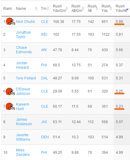
Personally, I would love to see how a Keenum-Beckham duo would do as an experiment. What if OBJ were to catch 8 of 10 passes from Case Keenum? That would be an important data-point, no? It would isolate the problem in Baker. More precisely: in Baker’s head, because we know he can physically play at an elite level.
The Browns Need a New Offensive Scheme
Having Keenum take a few reps with OBJ is unlikely to happen because benching Baker, even briefly, would be crazy controversial. But what could politically be done is for the team to return to Stefanski’s original solution to this problem that he deployed when he took over in 2020: a strict Shanahan-Kubiak offense where Baker is the game manager handing the ball off to Chubb & Hunt, and throwing short passes to his tight-ends, as OBJ runs down the field as a decoy.
It was good enough for a 4-2 record to start the 2020 season before the dynamic was changed by OBJ’s injury. So, my advice to Stefanski, if he continues to be saddled with playing Baker & OBJ, is to roll back the passing game, amp up the ground game, and let a strong defense take you to an 11-6 record. And keep your fingers crossed that that will be good enough for a playoff berth.
It’s Time for a Baker-Beckham No-Fault Divorce
It’s sad watching Baker regress like this, and it will likely cost him millions of dollars. I have tried my best to prevent this outcome, but after writing passionately on this topic for a couple of years now, there is really nothing else I can do.
As for OBJ, he really should ask for a trade. It’s blatantly clear now that he is not going to get what he wants by playing with Baker.
Again, they tried, they failed, and now it is time to give up. It’s time to stop banging your heads against the fucking wall. Just “putting your best players on the field” is not working. Baker & OBJ are not suddenly just going to “click.” We can’t even identify the problem, let alone address it.
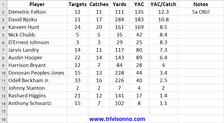
OBJ had no trouble catching balls from Eli Manning. Baker has no trouble throwing balls to Landry, Higgins, and Njoku. A divorce will free each player to get back to their elite level of play.
OBJ fanbois act as if trading OBJ will yield nothing in return, but that is not the case. OBJ looks fantastic, and would return substantial value. Maybe we could get a two-legged left-tackle for him…
The Rashard Higgins Mystery
Speaking of Higgins…don’t you think it was odd that Baker hit Hig so easily against the Vikings, but couldn’t hit OBJ to save his life? Even when OBJ was wide open? Normally, Hig isn’t allowed on the field until all the other receivers have sustained injuries, and we rarely see him at the same time as OBJ. So, here is another theory:
Nobody expects Higgins to even play, let along catch a pass. So, with zero expectations, there is zero pressure on Baker to throw to him, and his body relaxes, and he throws a nice, smooth pass. The exact opposite happens when he throws to OBJ where there are MASSIVE expectations. His body tenses up, and he throws a bad pass.
Letting Higgins play, and get some targets, is one thing the coaching staff got right on Sunday. So, good for them. One thing we KNOW about Baker is that he plays extremely well when Higgins, Landry, and Njoku are his primary targets. That is the only solution that we know of, yet the Village Idiot rejects it.
The team has been trying to force the big-dollar investments in OBJ & Austin Hooper to work, but it is long past time they give up on those sunk costs and get back to what we KNOW works.
Mary Kay Cabot was TOTALLY Wrong
Here’s what she wrote back in February:
“If he’s back, I think Beckham and Mayfield will flourish from the start, and that he [Beckham] will return to a Pro Bowl-caliber level.”
And Cabot’s partner in crime at Cleveland.com, Ellis Williams, wrote this:
“Assuming Mayfield picks up where he left off, I’m forecasting Beckham opening the 2021 season in electric fashion.”
Well, Baker did pick up where he left off, right up until he hit the brick wall when OBJ returned.
But guess what? After assuring us dozens of times over the summer that Baker & OBJ would get along just swimmingly, Mary Kay Cabot finally broke down and admitted that there is a problem. And she even has her own theory! Here is what she said on the “Orange and Brown Talk” podcast Monday:
“I think sometimes Baker gets almost a little too hyped up. He gets a little too much juice; a little too much adrenaline. And he can’t bring himself down. He can’t control himself.”
As I said above, none of us are mind-readers, so Cabot could be right. However, Baker has been thick as thieves with OBJ for a couple of years now. How could his adrenal glands still be going berserk when he is throwing a ball to OBJ? Also, we need solutions, not just theories. And we also need to convince the Browns to run experiments on our theories. Because the Browns clearly have no intention of doing anything at all. Like Stefanski said, “That’s not really a concern of mine or ours.” They are just going to keep sending Baker & Odell out there until they stop sucking. Not exactly a policy that is “Coach of the Year” material…but perhaps Stefanski is trying to tell us that the decision is not in his hands, but being handed down from above.
Browns Notes
Note: Yes, I know Baker’s left arm might be bothering him, but last year, he played at an elite level with a cracked rib. If his shoulder were the problem, he wouldn’t have been able to throw those laser beams to Hig.
Note: Baker got hit with not only the return of OBJ, but the loss of Landry, in the same game. And the Browns deployed a one-legged man at left tackle. That’s a lot to deal with, and it is amazing that Baker won the game, and did so without fumbling or throwing an interception.
Note: It wasn’t just an “off day.” It’s an off half-the-season so far. Baker has hit rock bottom and drilled deeper! During the last two weeks, Baker has managed to rank at #33 in the 32-team league with an abysmal completion rate of 53.1%. Go here and make sure the split is set to “Last 2 Weeks” to capture the Bears & Vikings games.
Note: Say goodbye to “Good Baker” because “Bad Baker” is back to stay. The blog I wrote on this eight months ago has held up well: Good Baker/Bad Baker Mystery Solved.
Note: was CBS announcer Kevin Harlan’s sing-song delivery nauseating or what? Hate that.
Note: Myles Garrett’s shirtless press conference before the Bears game lit a fire under the Browns defense. I think you could also include DC Joe Woods in that fire. Did Myles convince the DC to get more aggressive? I think so.
Note: I didn’t know it, but PFF grades QB-WR duos. John Kosko, Lead Analyst of PFF was on the Locked On Browns Podcast “Under the Lens 4” episode this week. At the 16:50 mark of the show, Kosko says that Baker has a grade of 90.7 when OBJ is not on the field. And when OBJ is on the field, Baker’s grade plunges to a 68.7. He thinks it is a Baker issue and not OBJ’s fault, and Baker has a mental block. Kosko says that OBJ’s route running vs the Vikings was awesome, so the Browns could easily get some nice trade offers for OBJ. And that is the only way to solve the problem because it is far more difficult to replace a franchise QB than it is a receiver. [Emphasis mine.]
Note: What if Dee Haslam is smitten by both Baker & OBJ and insists on having them both on her team? Then we all would be just wasting our breath, now wouldn’t we?